

Designing for ceramic cups requires more than just creativity. You need the right methods to make sure your design looks sharp, clear, and durable after printing. Below, we will explore important steps and techniques in detail to help you prepare your artwork for professional-quality printing on ceramic cups.
Understanding the Basics of Ceramic Printing
Before starting the design, it is important to know how ceramic printing works. Unlike printing on paper, ceramic surfaces require special preparation. The design is usually transferred with heat, sublimation, or screen-printing methods. Each method demands careful handling of artwork to ensure the final product does not look blurry.
Ceramic surfaces are not flat like sheets of paper. The curved shape means your design needs to wrap smoothly around the cup. A mistake in sizing or placement can distort the image. Therefore, you must use design templates made for cups to avoid errors. These templates allow you to see exactly how the artwork will look once printed.
It is also helpful to understand that ceramic cups often go through heat treatment. This process makes the design permanent. For this reason, low-quality images may fade or crack after printing. By knowing the basics of ceramic printing, you can avoid common mistakes and set a strong foundation for your design work.
Another key point is the type of cup you choose. Glossy cups may show brighter colors, while matte cups can give a subtle effect. Deciding this in the early stage will save you from reworking the design later. In short, learning the basics first ensures your design will meet both creative and technical standards.
Choosing the Right Design Software
The software you use plays a big role in preparing artwork for ceramic cups. Professional tools like Adobe Illustrator or Photoshop are popular choices. They provide flexibility to create detailed designs with high precision. If you want free options, GIMP or Inkscape can also work well.
Vector-based software is often preferred because it allows resizing without losing quality. This is important because cup templates may require you to adjust artwork multiple times. A pixelated design will never look good on a ceramic surface. Therefore, vector files ensure sharp edges and clean lines even after scaling.
Good design software also helps in color correction. Colors on a computer screen often look different after printing. By using built-in color management tools, you can adjust the shades to get the closest match possible. Some programs also allow you to preview how the design will look when wrapped around a curved surface.
Another feature to look for is layering. Layers make it easy to edit one part of the design without affecting the rest. This saves time and reduces errors during adjustments. With the right software, you will be able to test different versions of the design before finalizing it.
Setting Correct Dimensions and Resolution
Resolution and dimensions are vital for cup printing. A common mistake is designing with low resolution, which makes the final print blurry. Always set your resolution to at least 300 DPI. This ensures sharp images that can withstand the printing process.
The size of your canvas should match the cup template. For a standard 11oz cup, the design area is about 8.5 inches wide and 3.5 inches tall. However, sizes vary, so you must check with the printing provider. Incorrect dimensions may cause parts of your design to get cut off.
Another important point is the bleed area. You should add a little extra space around the edges of your design. This helps prevent white lines from showing after trimming. It is better to prepare for these small adjustments in advance.
Designing within a safe zone is also recommended. Keep important text and logos away from the edges. Otherwise, they may appear distorted on the curved surface. These steps ensure that the design looks professional when transferred to the ceramic cup.
Selecting the Right Colors for Ceramic Cups
Colors behave differently on ceramic surfaces compared to paper. Bright colors may appear dull if not adjusted properly. Therefore, you need to use CMYK color mode instead of RGB. CMYK is designed for printing and provides a more accurate output.
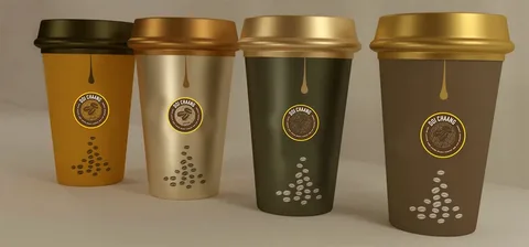
Another factor to consider is the background color of the cup. A white background usually makes colors stand out. On darker cups, you may need to add a base layer of white ink. This helps the design remain visible and vibrant. Always check with your printer to know what options are available.
You should also test color samples before finalizing a large order. Many printing providers allow you to print a single piece as a trial. This helps you see how the colors appear on the actual ceramic surface. If adjustments are needed, you can fix them before mass production.
In addition, you must avoid using too many colors in a single design. Simple color schemes often look better and print more clearly. Overly complex designs may not translate well on curved ceramic surfaces. By carefully selecting colors, you can create a design that is both attractive and practical.
Preparing Text and Typography
Typography requires special attention when printing on cups. Small text may become hard to read after printing, especially if placed near curved areas. It is better to use larger fonts with clean, bold styles. Avoid thin fonts as they may fade or break during the transfer process.
When placing text, always keep it within the safe zone of the template. Placing words too close to the edges increases the risk of distortion. Alignment is also important. Centered or evenly spaced text usually looks better on cups. Uneven placement can make the design look unbalanced.
Another tip is to convert text into outlines before sending files to the printer. This ensures the font style will not change if the provider does not have the font installed. Converting text into outlines keeps the design consistent.
Finally, test your typography with a mockup. A digital preview will help you check readability and placement. By preparing text carefully, you avoid common printing problems and improve the final look of your cup design.
Using High-Quality Images
Images are a central part of cup designs. However, low-quality images can ruin the entire look. Always use high-resolution images with at least 300 DPI. Anything lower may appear blurry or pixelated.
Stock photos can be useful, but make sure they are licensed for commercial use. Original artwork or photography often works best because it makes your design unique. Avoid images with too many small details, as they may not print clearly on curved surfaces.
You should also check the contrast of your images. Dark images may lose details after printing, while overly bright images may appear washed out. Adjusting brightness and contrast before finalizing the design is important.
Another key step is testing how the image looks in different positions on the template. Some images may not wrap well around the cup. By testing placement in advance, you avoid surprises in the final product. Using high-quality images guarantees that your design will look professional and durable.
Adding Finishing Touches and Special Effects
Once your main design is ready, you can enhance it with finishing touches. Gradients, shadows, or textures can add depth. However, these effects must be used carefully. Too many effects may reduce clarity after printing.
Another popular option is adding a background pattern. Simple stripes, dots, or abstract shapes can make the design more appealing. Just ensure the background does not overpower the main artwork or text. Balance is key.
You may also explore metallic or glossy finishes if your printing provider supports them. These finishes can make designs look more premium. Some designers also add a personal touch, such as initials or quotes, to create custom pieces.
Remember to keep the overall design simple and easy to view. Complex effects may look good on screen but often fail in print. By adding thoughtful finishing touches, you can make your ceramic cup design stand out without sacrificing clarity.
Reviewing and Exporting the Final Design
The final step before printing is reviewing your design. Carefully check for spelling errors, misaligned elements, or color mismatches. Ask someone else to review the design as well, as a fresh perspective can catch mistakes you missed.
When exporting, always save in the file format required by your printer. Common formats include PDF, TIFF, or PNG. These formats preserve quality and prevent distortion. Vector files are especially useful because they keep designs sharp.
Make sure to include bleed areas in the exported file. This ensures the design covers the entire print area without leaving gaps. Also, avoid compressing the file too much, as this can reduce image quality.
If you are ordering through professional services like https://ibexpackaging.com/custom-cups/, check their file requirements. Following their guidelines will save time and prevent issues during production. Once exported correctly, your design will be ready for high-quality printing on ceramic cups.
Conclusion
Preparing designs for ceramic cup printing requires careful planning and attention to detail. From choosing the right software and setting correct dimensions to selecting colors and refining typography, every step plays a vital role in the outcome. High-quality images, proper resolution, and thoughtful finishing touches help ensure the final product looks professional and lasts long. By testing designs through mockups and reviewing them before export, you reduce errors and save both time and cost. With the right approach, your ceramic cup designs will not only stand out visually but also meet professional printing standards, making them perfect for personal use or business branding.